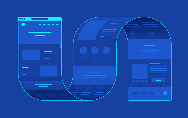
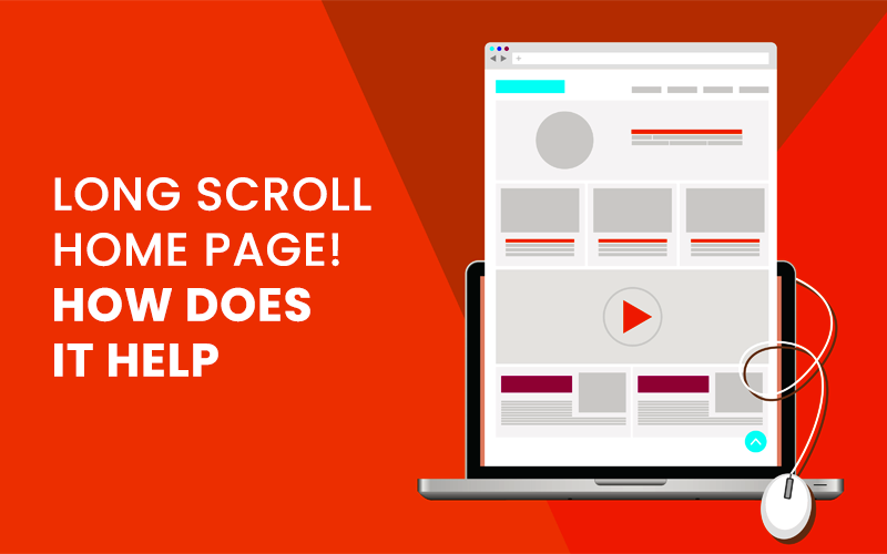
It should be made with the goal of making a great first impression, which will entice visitors to stay and explore the website further.
Most home pages have the issue of trying to fit too much information into a small area, which can be overwhelming for visitors. Making a long scroll home page is a current web design trend that enables Website Design Company to include more information without making the page look cluttered.
The advantages and disadvantages of long scroll home pages and how they can be used to enhance user experience will be covered in this article.
The argument between above-the-fold and no-fold appears to be shifting in favor of the latter strategy. The idea that the most crucial information on a website should appear above the fold has long been accepted as fact. Most users, it is claimed, are hesitant to scroll down a page if they haven’t already found what they’re looking for.
However, there is no longer any validity to this claim. Users will happily scroll down a homepage or landing page as long as the content is pertinent to their needs and holds the promise of good things to come.
Advantages

Long scrolling websites have some very compelling advantages, especially if you’re worried about your mobile audience. Consider:
Fast Information Access
Visitors to your website can typically access what they need without making multiple clicks because all of the necessary information is on a single, extremely long webpage.
Due to the fact that users don’t need to figure out how or where to navigate from the home page, these websites frequently experience lower “bounce” rates. When everything is present, users can scroll down instead of clicking away from the page or, worse yet, leaving the website.
Indulge the user into the story
In many ways, the ideal format for storytelling is a long scrolling website. With a creative, seamless design that has a distinct start, middle, and end, you can completely engross users in the narrative of your brand.
When it comes to storytelling, traditional websites typically lack the level of engagement that dynamic content like imagery can provide because the user is compelled to click here and there without ever getting the full picture all at once.
Designed for Mobile
On a mobile screen, the long scroll format works well. It makes sense to use a format that is friendly to your mobile audience given that most users search using a mobile device.
Analyze the website’s web analytics tools to see what proportion of your own target market uses mobile devices to access the internet. The research will assist you in making these critical design decisions.
Low bounce rate
In the case of a long scroll page, users are more likely to stay on it for longer, which lowers the bounce rate because they can see more information on the Home Page.
The appeal of the long scroll is twofold: if the user finds the content in front of them interesting, they can stop scrolling and shine a spotlight on it. If not, they can scroll further until they come across something that does grab their attention!
When intriguing content is offered, interactive storytelling significantly reduces the user bounce rate. This ultimately leads to a high level of brand, company, or service immersion.
Disadvantages

Wait and consider the drawbacks of one-page websites before instructing your designer to go with a long scroll website. Some flaws in the scrolling design may be deal-breakers for your particular industry.
Loss of Vital Information
A great scrolling website should give users access to all pertinent information and make it simple for them to navigate. On the long page, there is a lot of information, which can be confusing. Users who scroll up and down to find the information they need risk losing important items.
Site speed issues
UX White space creates balance and makes important elements on a web page stand out, as designers are well aware. Images aid in creating white space on a scrolling webpage.
However, having too many graphics and animations may increase loading. Your website may have slow loading times, which is the final nail in the coffin, especially if you’re trying to market to the mobile audience that this format is meant to appeal to.
Multiple animations demand a quick internet connection. If loading takes too long, users are more likely to leave. To make your lengthy page look appealing and balanced, filling it out and using more images than usual risk inflating the largest contentful paint (LCP). Additionally, using videos and animations may have a negative impact on how quickly a page loads.
SEO Can Be Hurt
A company has the chance to inform search engines on each page of its website that it has valuable, authoritative content to share. Every page represents a new opportunity to persuade these search engines to send visitors your way.
Your opportunities are more constrained with a one-page website. It becomes more difficult for your site to rank for multiple terms when you combine multiple pages and multiple terms for SEO Company In Delhi.
You’ve now seen a few of the advantages and disadvantages of long-scrolling websites. To make the best choice for your clients, keep these things in mind.
Here are some tips
- For a long-scrolling website, high-quality content is the most important factor in success. Nothing really matters if the content itself is poor.
- A strong visual theme will help users understand the story from the previous screen, or scroll continues. A visual line can be formed from scroll to scroll using visual cues like a common color theme, arrows, connecting lines, or even screens that appear to overlap. This will make it easier for users to navigate the design.
- To keep the design flowing, use a scrolling technique like parallax, color-blocking, or mixed content types. The design alerts users to a change in content while maintaining its interest by utilizing and combining scrolling techniques. Users may scroll more because they want to see what happens next when these effects are present.
- Given that not all users will scroll all the way to the end of long-scrolling content, it is crucial to have the call-to-action in several places. No matter how engaging the interactions are, how compelling the story is, or how beautiful the visuals are.
With their short attention spans, the majority of users will decide within seconds whether and how to interact with the design. Ensure that the CTAs are visible and accessible from the start.
Although long-scrolling website designs are not new, strategies for improving the user experience are developing. Great content is the foundation, and how you curate the experience is the capstone.
Be aware that the design and user communities continue to debate various long-scrolling methods and concepts. Consider the advantages and disadvantages and whether this technique is appropriate for your fundamental idea before deciding. Then, measure analytics and conduct tests along the way to make sure it is working as planned.
